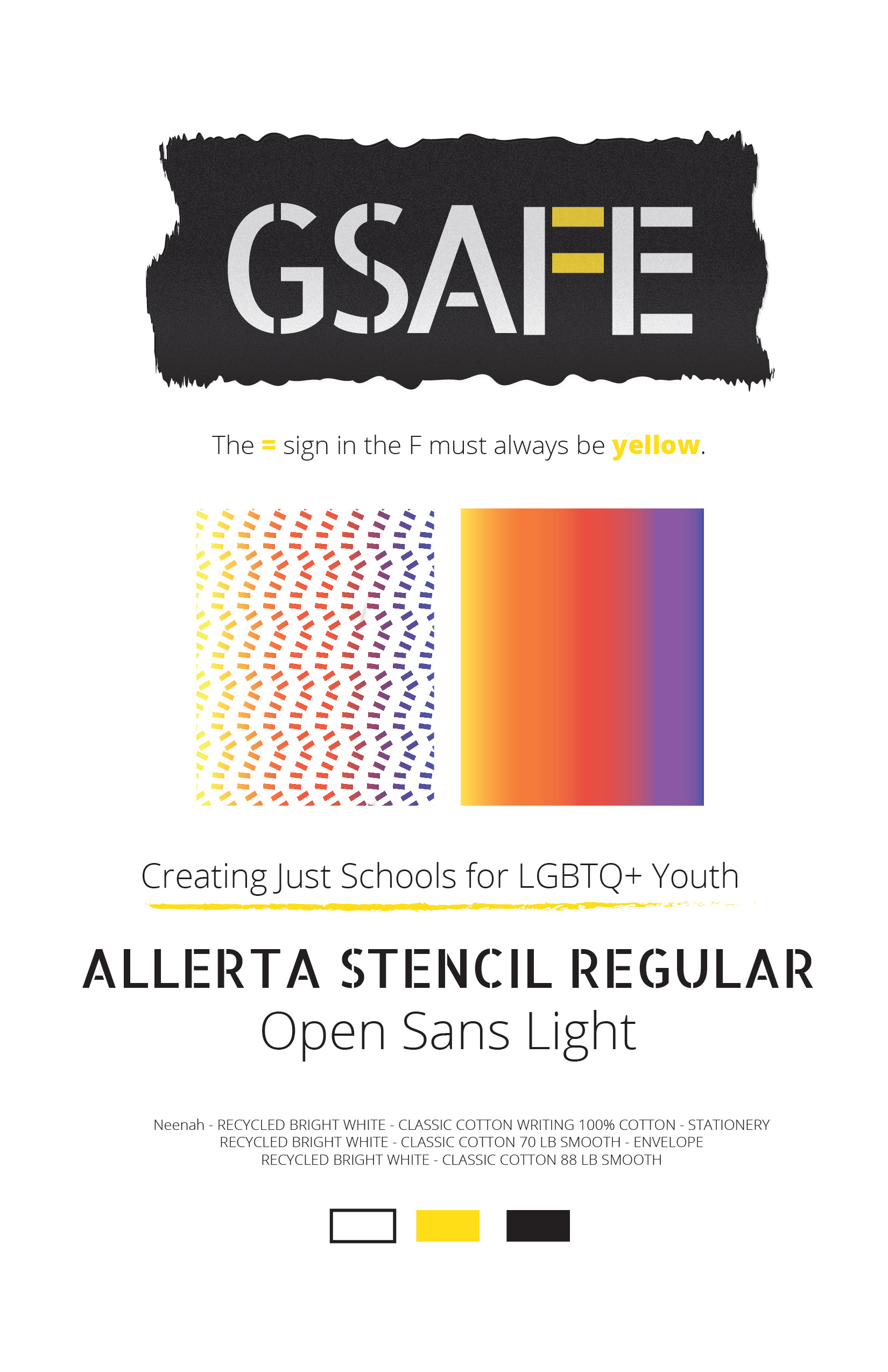
Brand Board
Logo
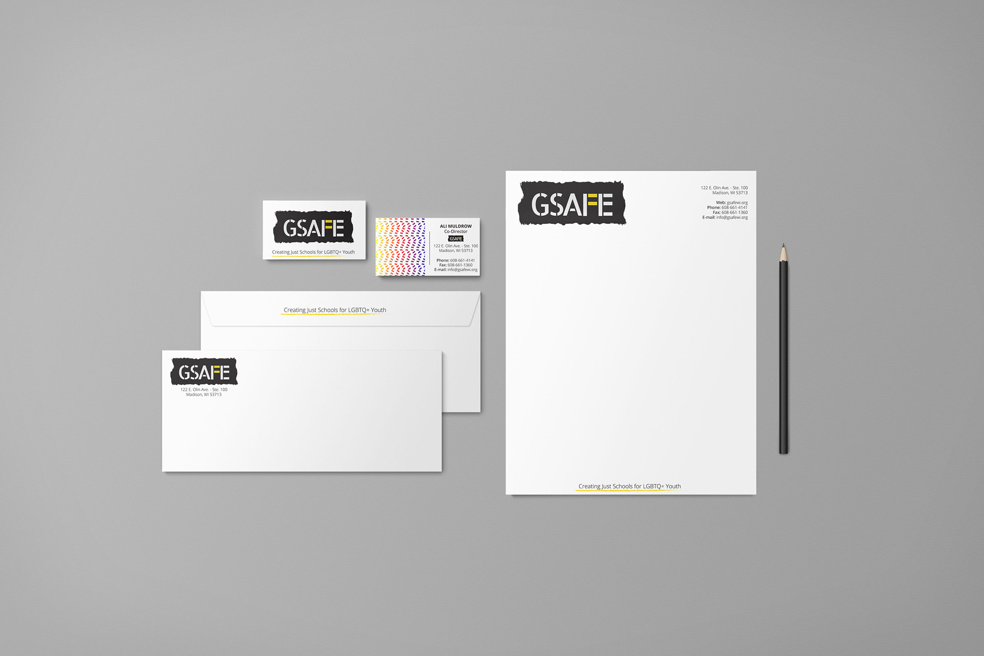
Stationery Suite
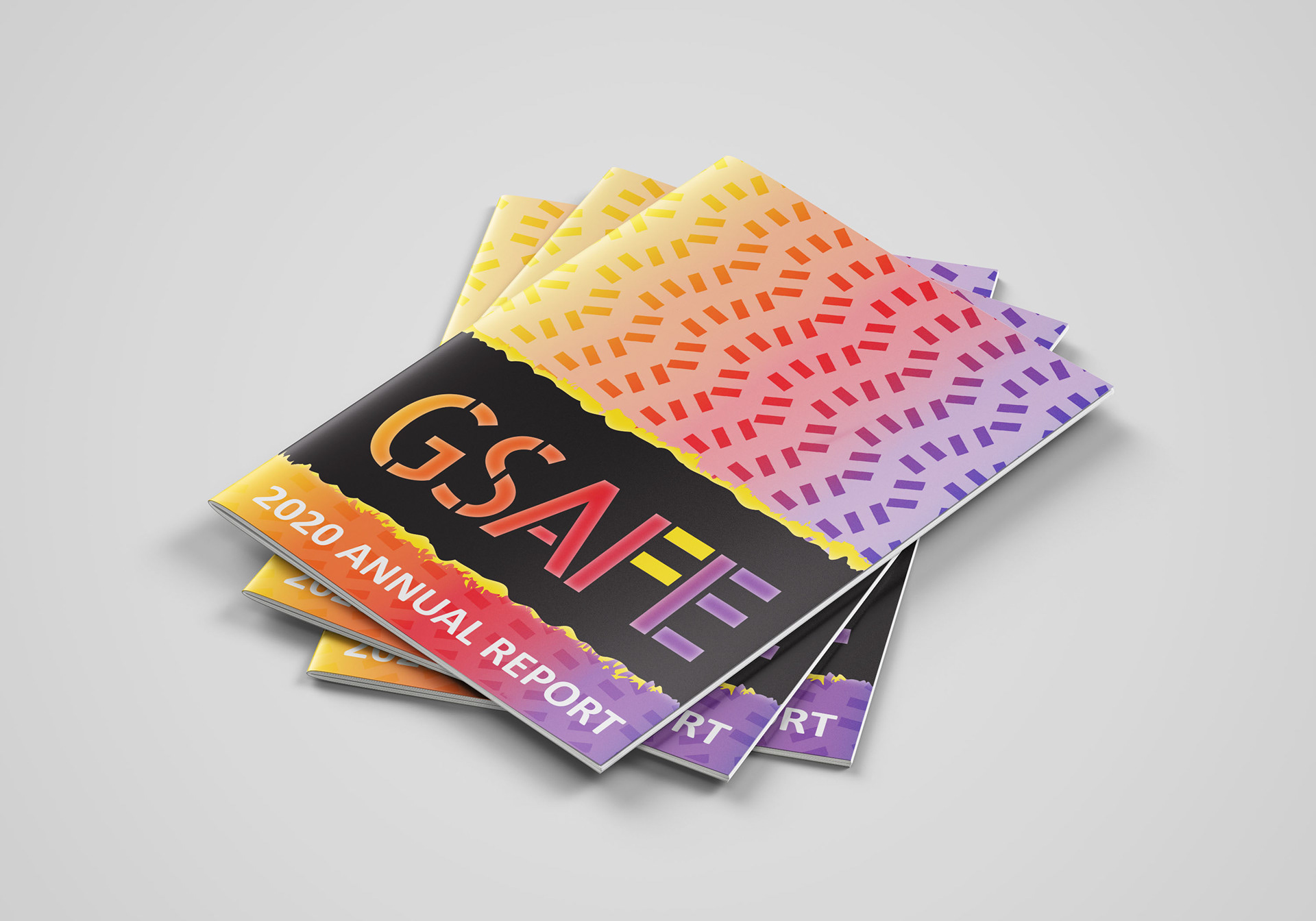
Annual Report
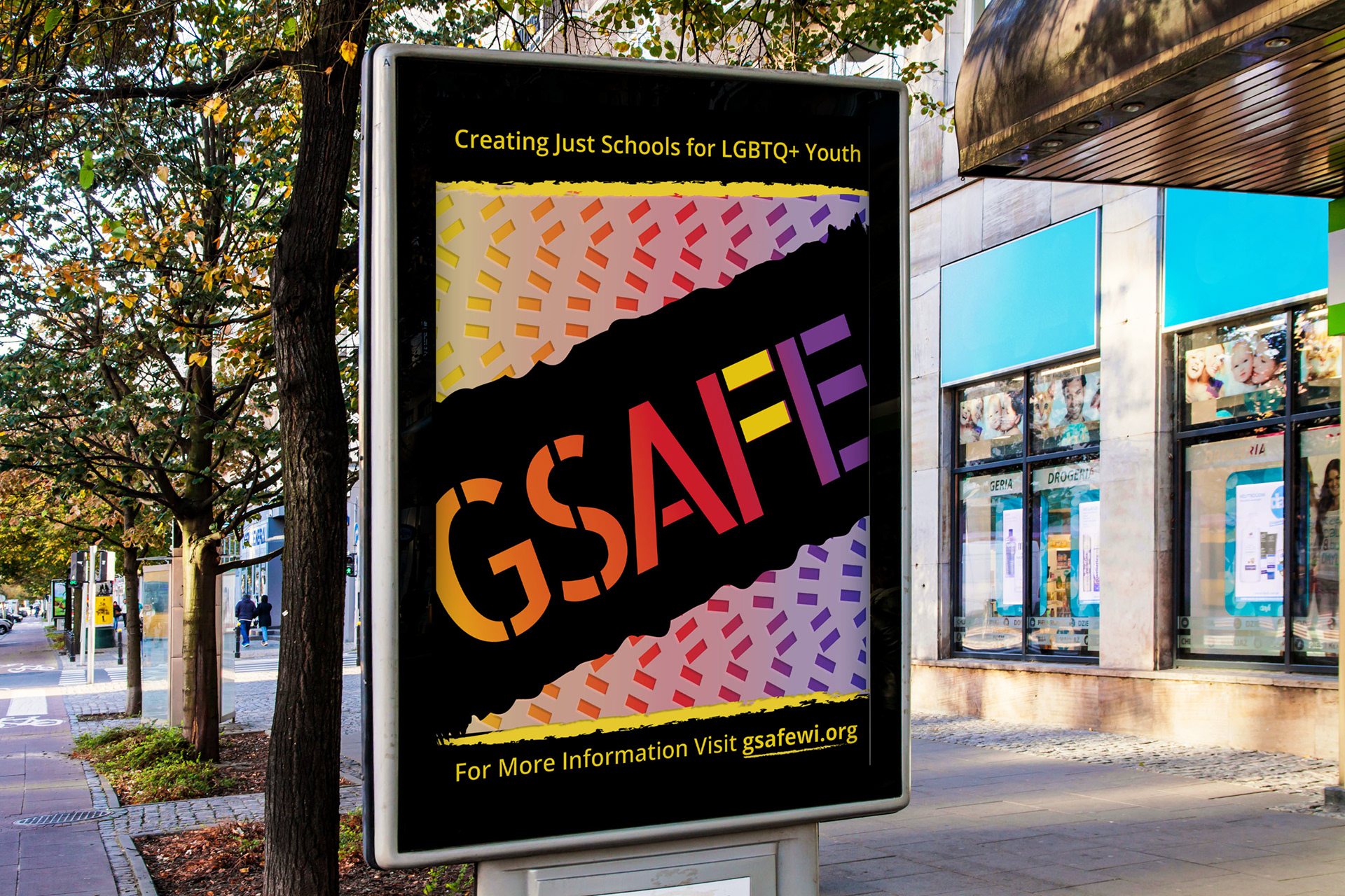
Outdoor Advertising
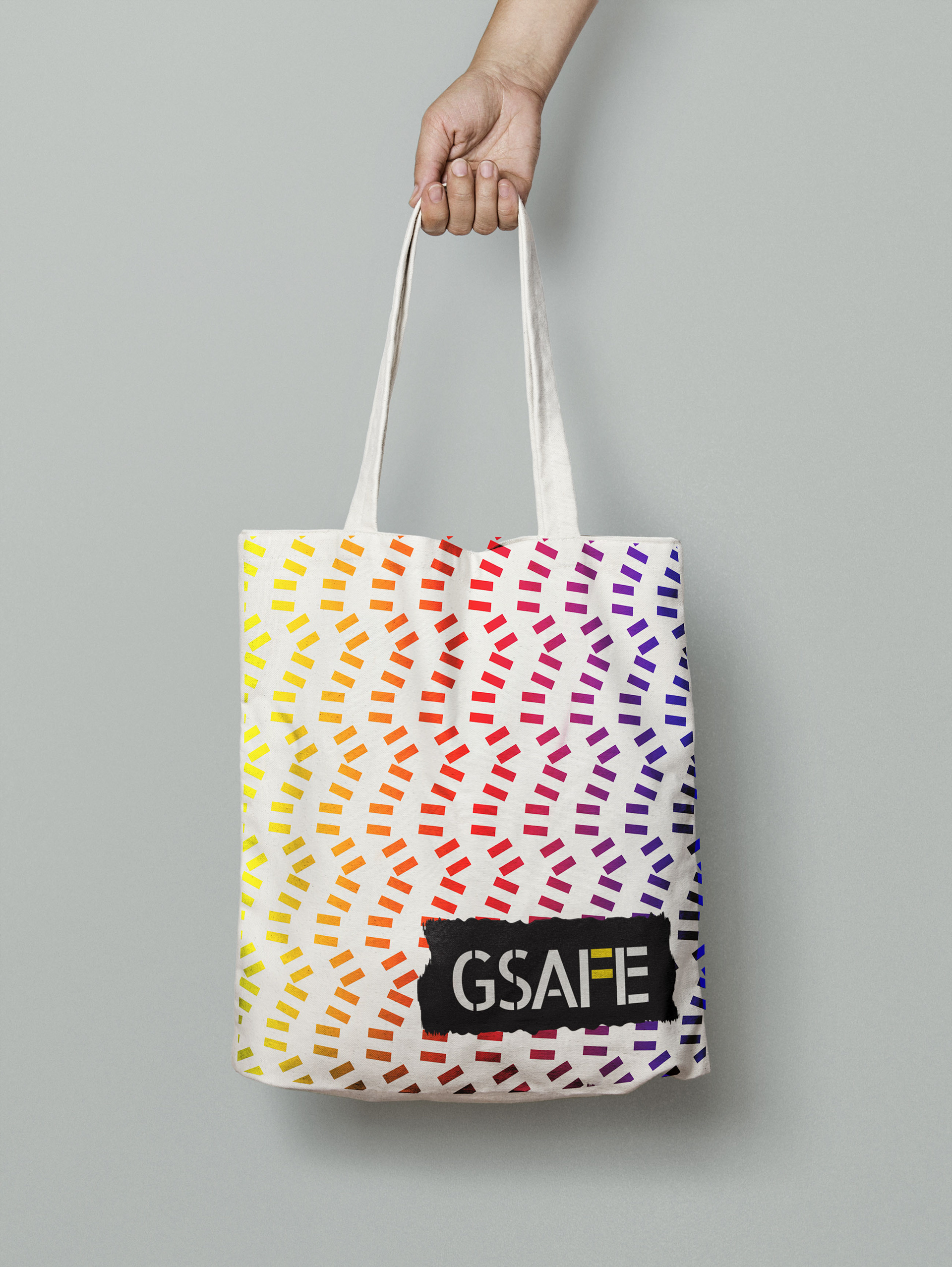
Tote
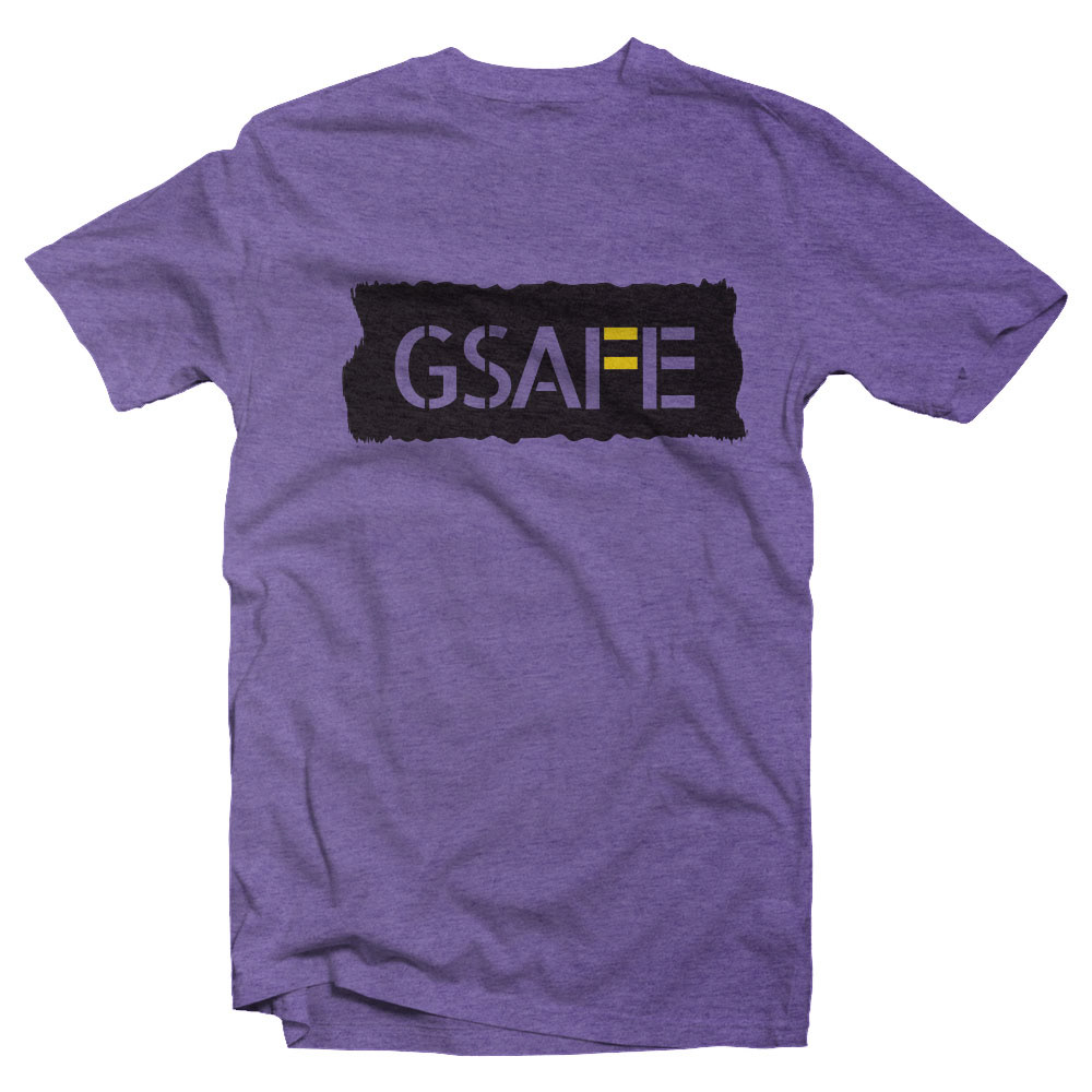
T-Shirt with Logo
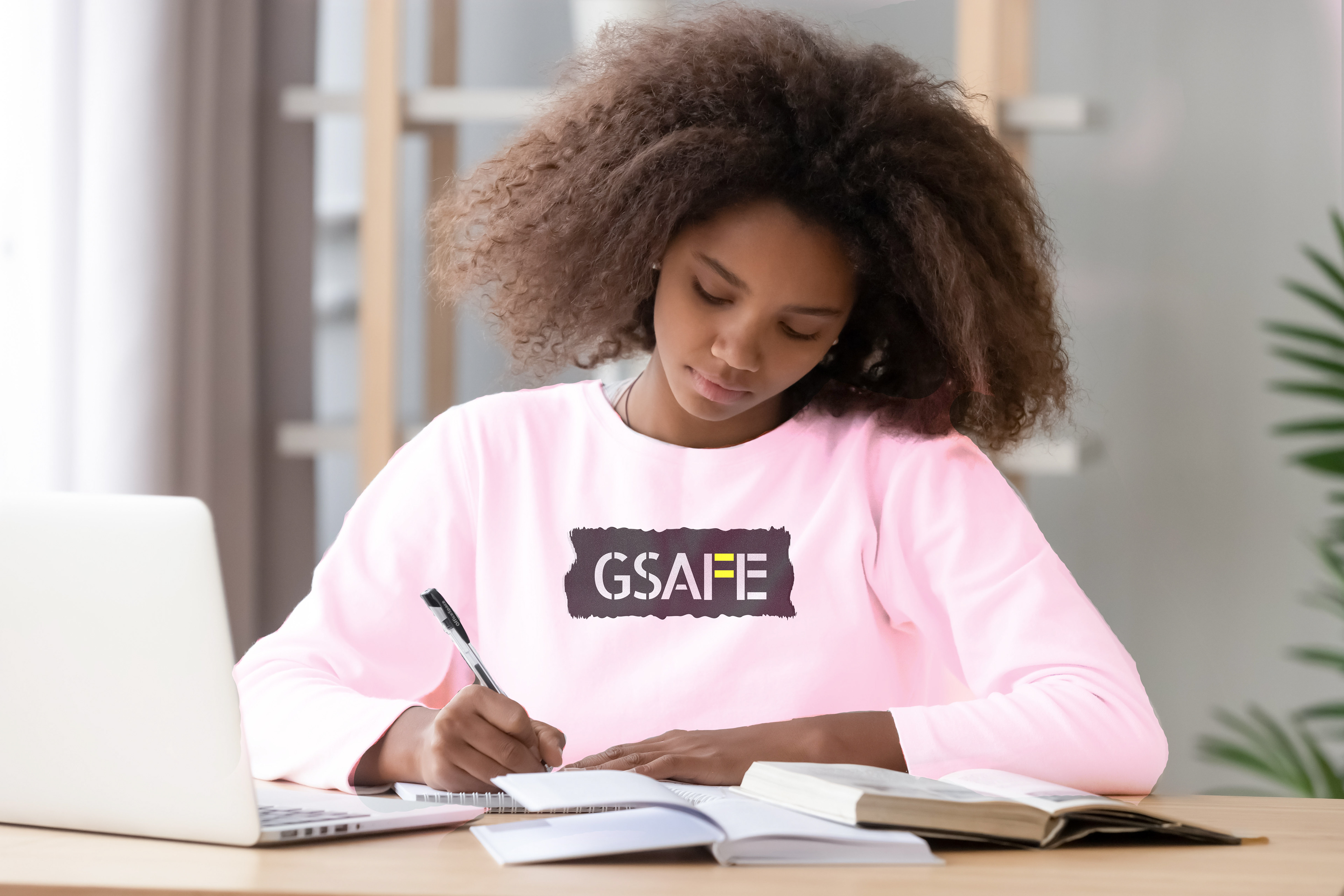
Sweatshirt with Logo
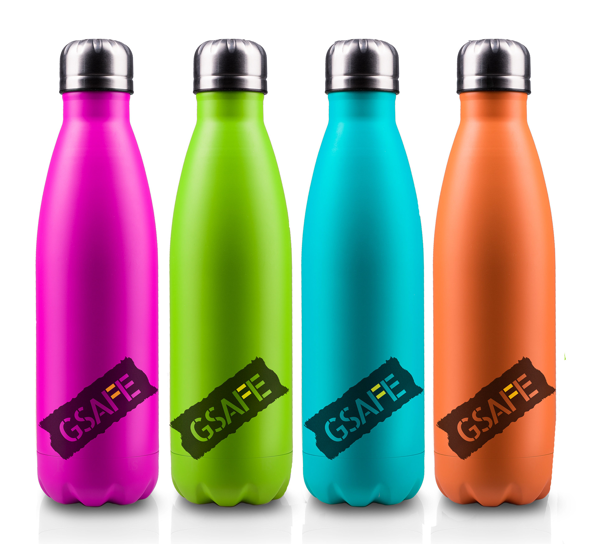
Water Bottles
The above images were a refining of a project from my Graphic Design class with Eric Tomlinson in 2018. The project was to re-design a brand from a local non-profit, and I randomly drew GSAFE whose mission to to serve LGBTQ+ youth in our schools.
Below you can see the assets I submitted in 2018. You can see the logo and the tote bag remained the same from 2018 to now. The logo contains the = sign from which the pattern was made. I received positive feedback from instructors and classmates on the pattern, so I decided to carry it through the rebranding more where weaker elements had been.
Below you can see the assets I submitted in 2018. You can see the logo and the tote bag remained the same from 2018 to now. The logo contains the = sign from which the pattern was made. I received positive feedback from instructors and classmates on the pattern, so I decided to carry it through the rebranding more where weaker elements had been.
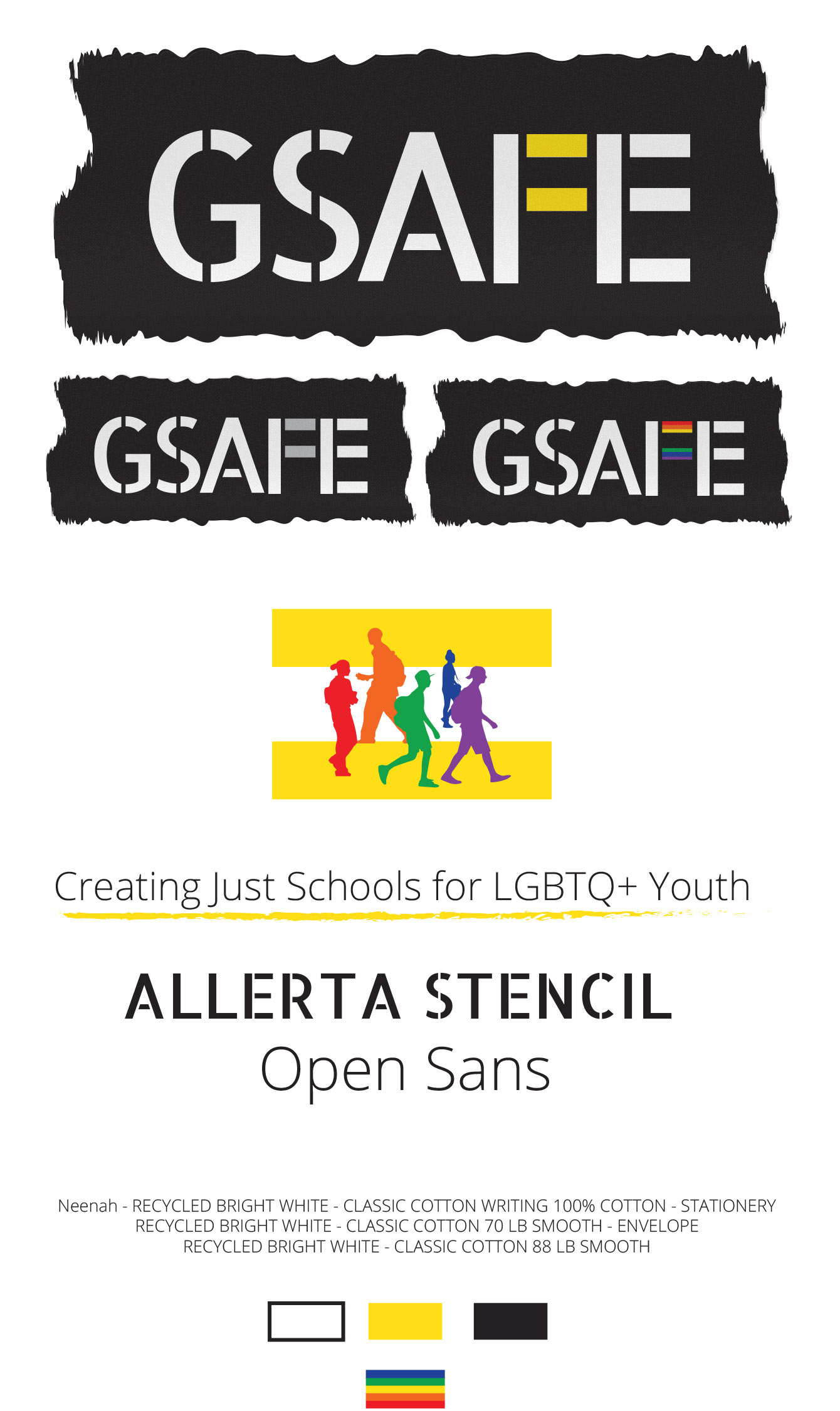
2018 Brand Board

Logo

2018 Stationery Suite
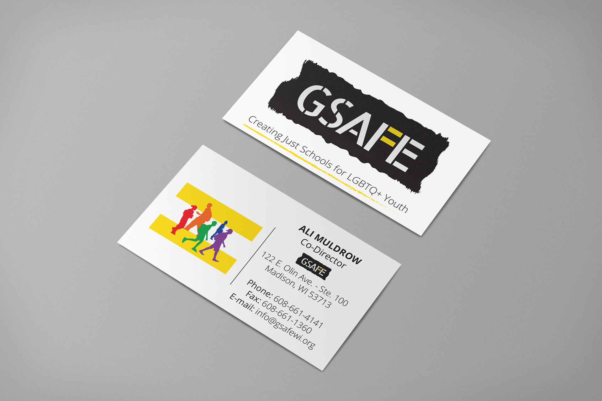
Business Card front & back
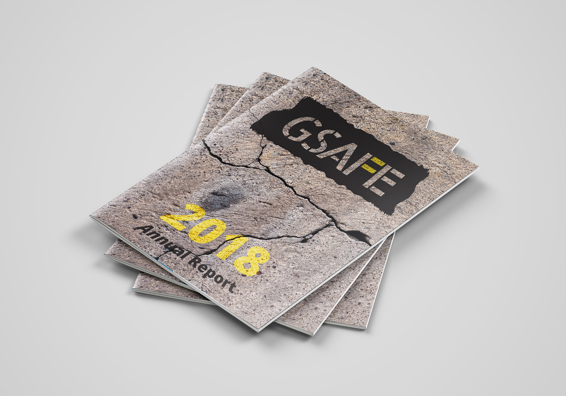
Annual Report
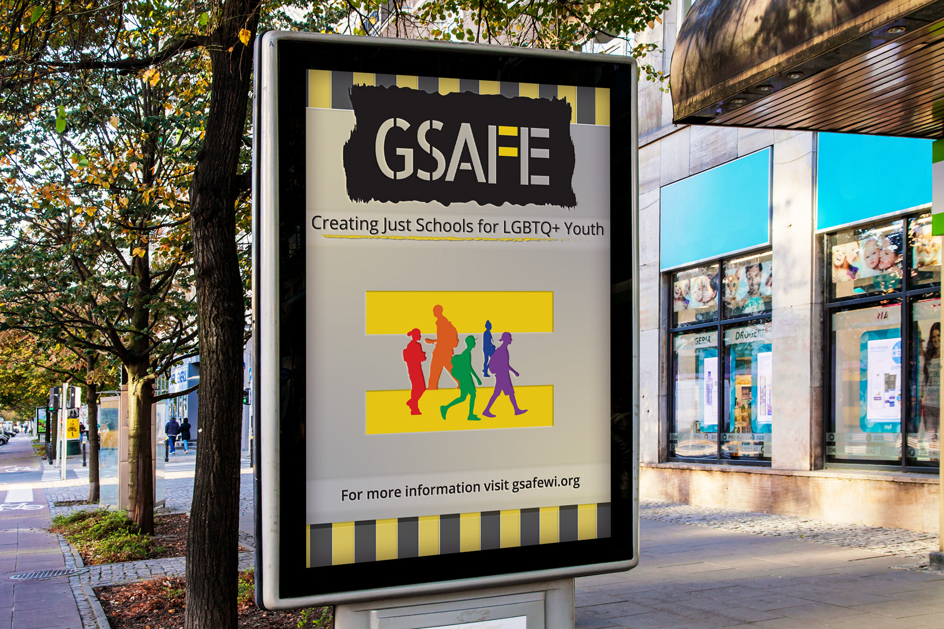
2018 Outdoor Advertising
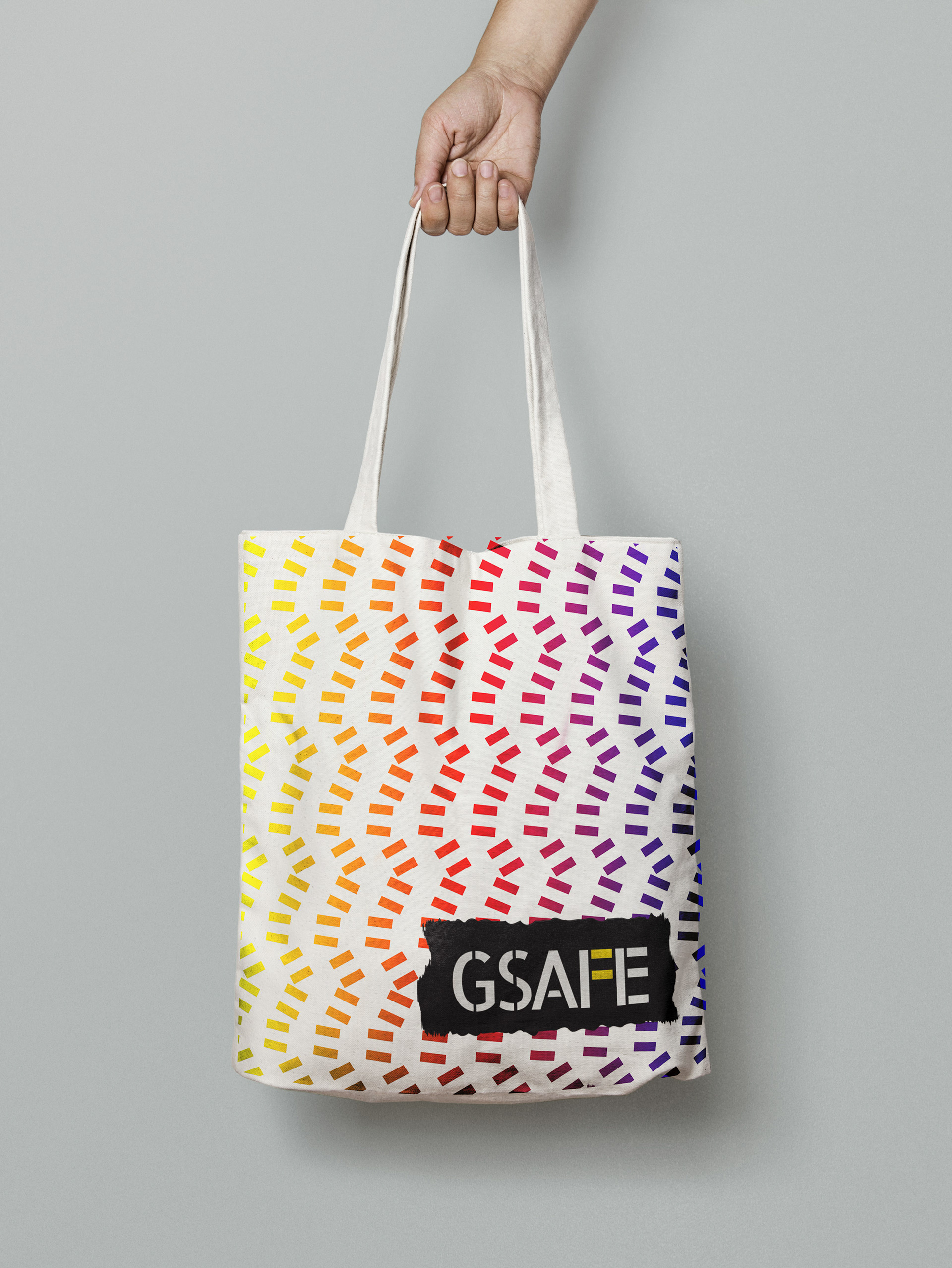
Tote
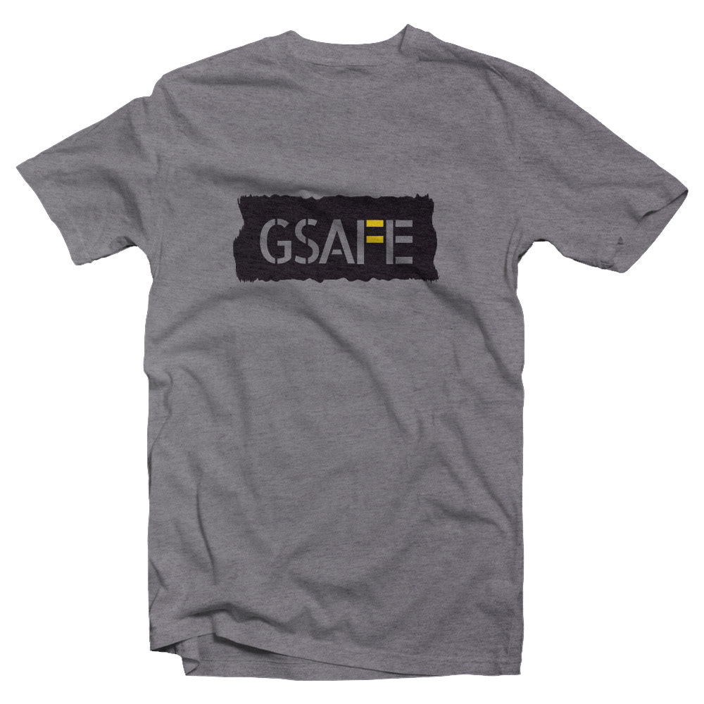
2018 T-Shirt
As you can see the 2018 version of the re-brand was quite a bit darker. The initial concept was that the logo would look spray painted on to surfaces like concrete and that is why gray is a frequent color choice. Yellow was chosen as a "safety" color as was black like a combination you might see on caution tape. Below you can see the beginning stages of this project with the development of the logo and initial sketches.
